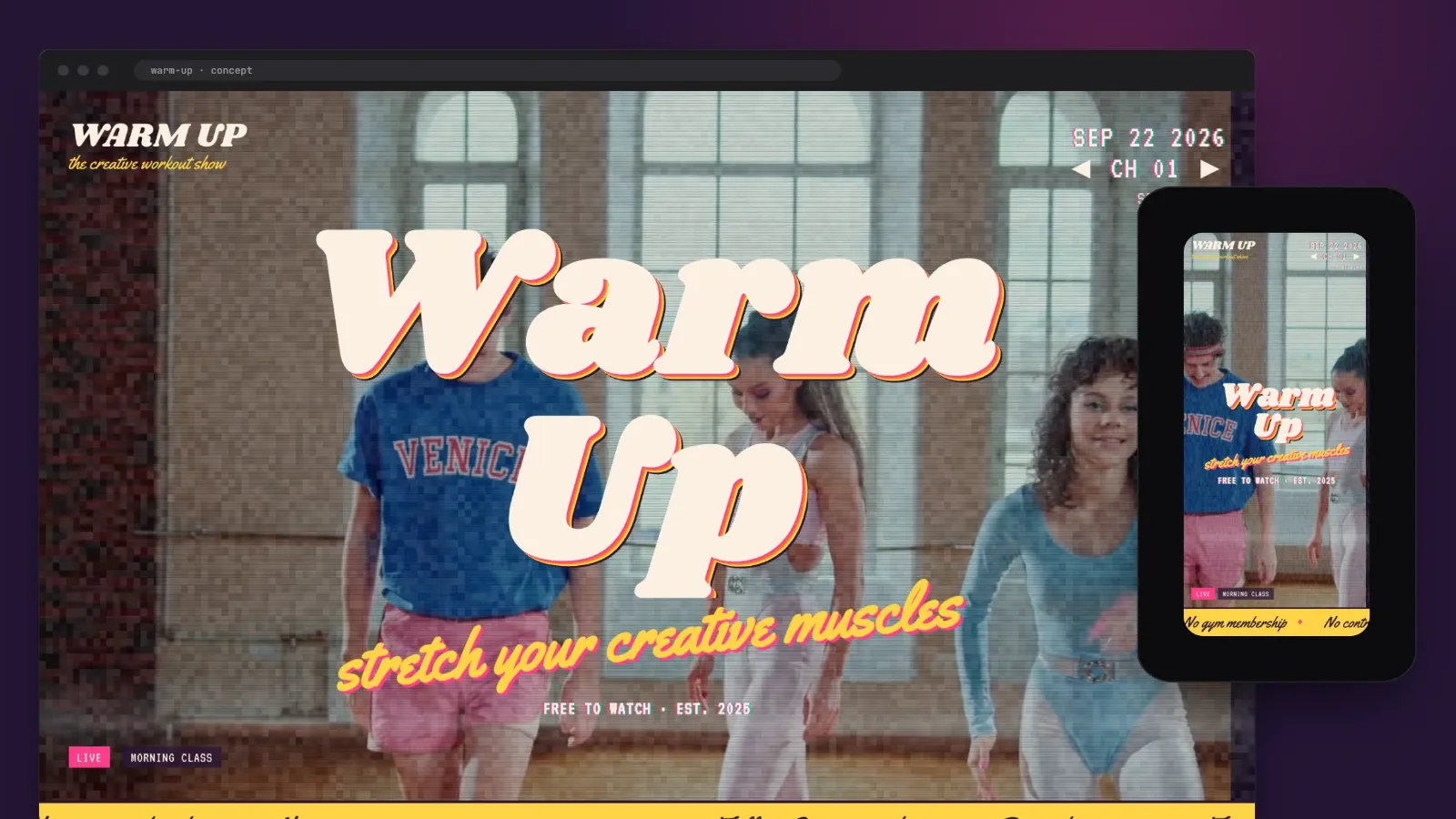
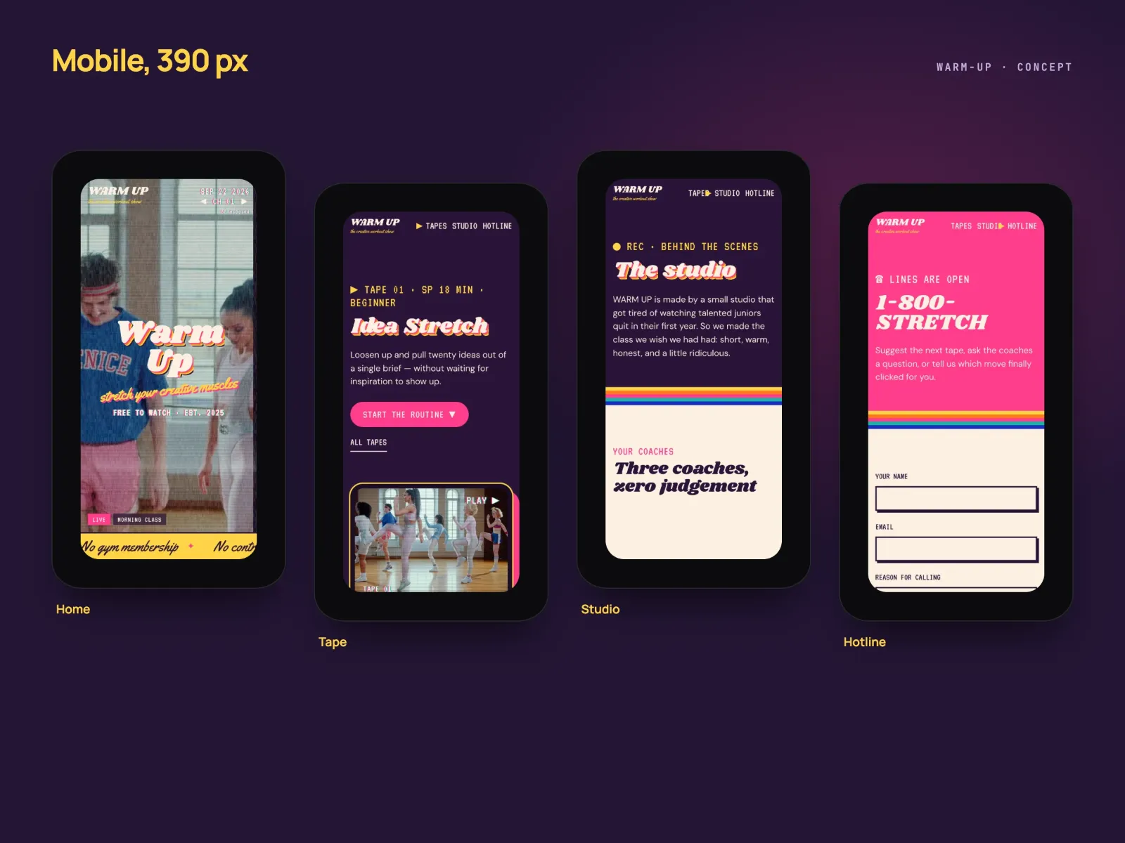
A concept site for a fictional retro TV show that treats creative skills as muscles and its design guides as workout VHS tapes: a VHS boot screen, a five-channel TV, 3D tape sleeves and a hotline.
Overview
WARM UP is a fictional retro TV show for people starting out in design. Its premise is that creative skills behave like muscles, so each guide is a workout VHS tape. I built the site as a concept, to show a playful, broadcast-style site in which one metaphor and its motion carry the teaching.
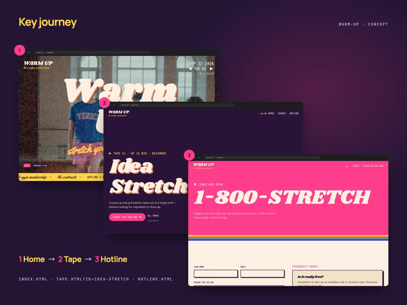
The site had to look like television from the first second, with a boot screen, channels and static, and still work as a guide: a visitor picks a tape, follows its routine and can call in to the show. Every effect had to serve the metaphor and leave the text readable.
7
pages
Source: Site source files, 22 Sep 2026
4
VHS tapes, one guide on each
Source: Site source files, 22 Sep 2026
5
moves in each tape’s routine
Source: Site source files, 22 Sep 2026
5
channels on the home-page TV
Source: Site source files, 22 Sep 2026
Approach
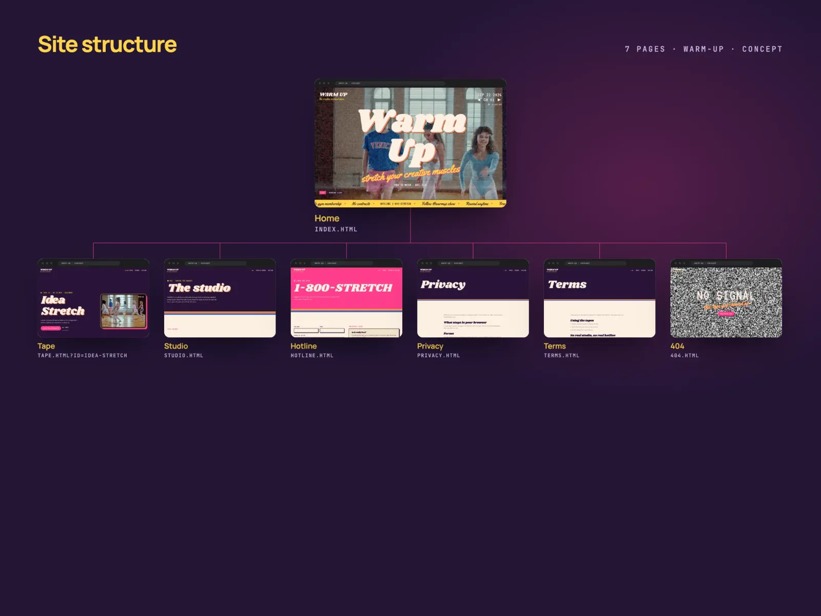
Seven pages: home, tape, studio, hotline, privacy, terms and a 404. There are 4 VHS tapes — Idea Stretch, Portfolio Pump, Critique Cardio and Pitch Cool-Down — each with a routine of 5 moves, and the home page holds a TV with 5 channels.
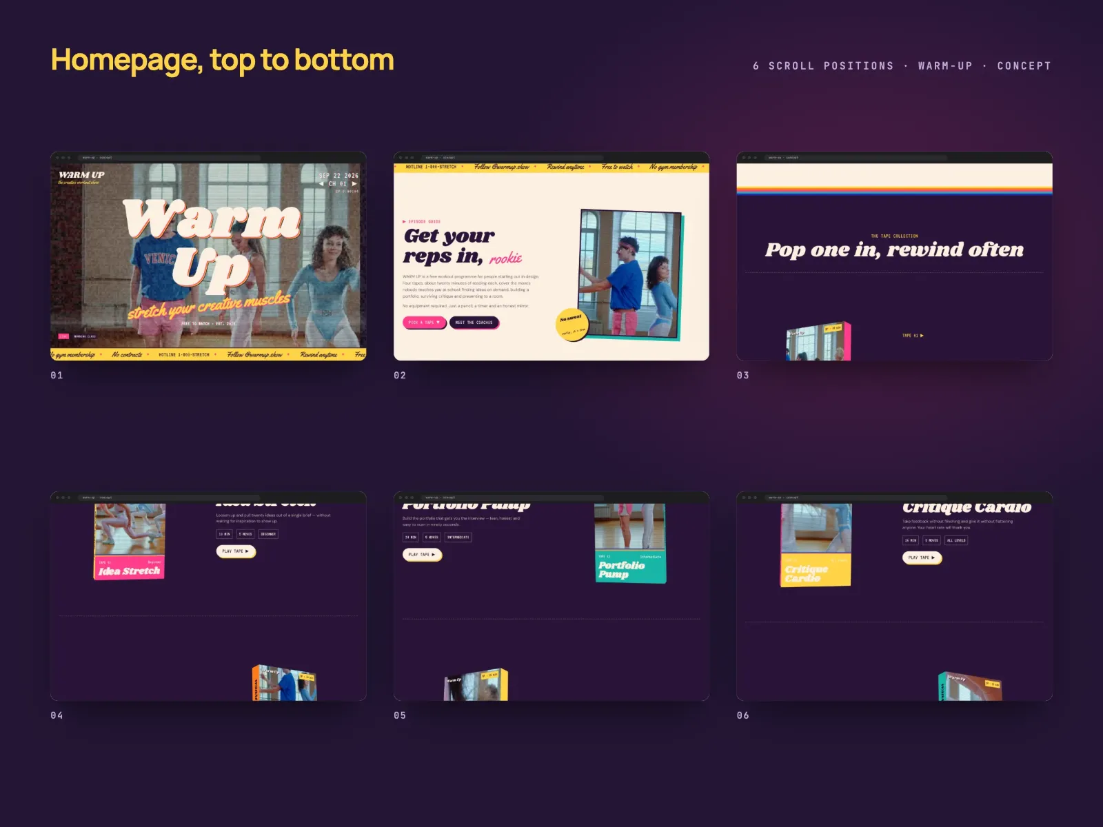
The home page opens on a VHS boot screen with PLAY, a tape counter and tracking. Then comes a five-channel TV switched with on-screen arrows or the keyboard, with static and lower thirds, an extruded retro title and a ticker. The tapes appear as 3D VHS sleeves built in CSS that rotate on scroll and play a preview on hover; a tape page has a TV-framed video, the routine of five moves with reps, a coach’s tip, common injuries, homework and the next tape.
The screen carries scanlines, a live static-noise canvas, a rolling tracking band, chromatic on-screen text and frame jitter; words pop in with a springy overshoot, and between pages the picture collapses into static with an FF or REW display. The site is plain HTML, CSS and JavaScript with GSAP, ScrollTrigger and Lenis; the call-in forms are demonstrations and send nothing.
Gallery
Results
The concept exists as 7 finished pages in English. On 22 September 2026 I checked 6 of them rendered in Chrome, leaving out the 404: all 6 have unique titles and exactly one H1, the language is declared, the layout holds at 390 px without sideways scroll, and no internal link is broken.
Lighthouse measured the home page. On mobile: performance 88, accessibility 95, best practices 77, SEO 100, LCP 2.7 s, CLS 0.048 and TBT 0 ms, with 9.8 MB across 21 requests. On desktop: performance 73 with LCP 0.9 s and TBT 0 ms, but CLS 0.577, because the channel and title block shifts while fonts and video load; the desktop home page weighs 13.4 MB because of the video.
SEO review
Lighthouse gives the home page SEO 100 on mobile and on desktop; performance is 88 on mobile and 73 on desktop, where the weak point is a layout shift of CLS 0.577. The on-page basics hold on the 6 pages checked; what needs a real domain is not there yet.
Lighthouse
Mobile
- Performance: 88 / 100
- Accessibility: 95 / 100
- Best practices: 77 / 100
- SEO: 100 / 100
- LCP
- 2.7 s
- CLS
- 0.048
- TBT
- 0 ms
- Weight
- 9.8 MB
Desktop
- Performance: 73 / 100
- Accessibility: 95 / 100
- Best practices: 77 / 100
- SEO: 100 / 100
- LCP
- 0.9 s
- CLS
- 0.577
- TBT
- 0 ms
- Weight
- 13 MB
In place: unique titles and one H1 on 6 of 6 pages, the page language (en), a layout without sideways scroll at 390 px and 0 broken internal links. Not yet right: only 2 of 6 titles are 30–65 characters long; partly done: 3 of 6 meta descriptions are 70–170 characters. Best practices is 77 because the Pexels video CDN sets third-party cookies.
Before launch: a domain, then canonical URLs and Open Graph titles and images on all 6 pages; JSON-LD with CreativeWorkSeries / TVSeries for the show, VideoObject and HowTo for each tape, Organization, and FAQPage for the hotline FAQ; sitemap.xml and robots.txt; longer versions of the 4 short titles and 3 short descriptions; reserved sizes for the channel and title block, so desktop CLS falls from 0.577 to under 0.1; and self-hosted, compressed video to remove the third-party cookies and bring the 13.4 MB desktop home page down, with a lighter file for phones (9.8 MB today).
| Check | Result | Status |
|---|---|---|
| Unique page titles | 6/6 | Pass |
| Title length | 2/6 | Fail |
| Meta descriptions | 3/6 | Needs work |
| One H1 per page | 6/6 | Pass |
| Language attribute | en | Pass |
| Mobile-friendly | 390 px | Pass |
| Image alt text | 0/0 | Pass |
| Broken internal links | 0 | Pass |
| Canonical URLs | 0/6 | Fail |
| Open Graph tags | 0/6 | Fail |
| Structured data | 0/6 | Fail |
| XML sitemap | 0/2 | Fail |
What this does not prove
WARM UP is a concept, not a commissioned project and not a real show. The show, its coaches, tapes, schedule and phone number are fictional, and the video is licensed stock from Pexels. The site has no domain, no audience, no search traffic and no calls to the hotline, so this case says nothing about how many people would watch it or learn from it.
The Lighthouse figures are lab measurements of one page on one day. The desktop layout shift (CLS 0.577) is a real defect that this version has not fixed, and the SEO score of 100 covers basics only: canonical URLs, Open Graph, JSON-LD, sitemap.xml and robots.txt are still missing.
Planning something similar? I read every message myself.
Next project
VITON13MEDICINEConcept biotech website Concept2026
All work (19)
Concept2026
All work (19)